Web Design - The Ultimate Guide
Web design refers to the design of websites that are displayed on the internet. It usually refers to the user experience aspects of website development rather than software development.
Let’s understand some more about it,
Concepts of Effective Web Design
Following is a guideline for good design -
- The website can be viewed on all the monitors like mobile, PC, tablet, etc. means must responsive.
- Fonts are of medium size, not so large and not so small. The most commonly used fonts are Times New Roman, Arial, Tahoma, and Verdana.
- The contrasting colors are preferred. The color contrast should not be more than three colors.
- The font color should be consistent throughout the website. Typically at the most two font colors are used.
- The navigation from one page to another must be smooth. The user need not have to spend much time thinking about how to navigate from one page to another.
- Use the three-click rule. The three-click rule or three-click rule is an unofficial web design rule concerning the design of website navigation. It suggests that a user of a website should be able to find any information with no more than three mouse clicks. It is based on the belief that users of a site will become frustrated and often leave if they cannot find the information within the three clicks.
- The web page should be loaded up in few seconds.
- The website must be compatible with all the most commonly used web browsers. Chrome and Mozilla Firefox are the most commonly used web browsers.
Following are the some symptoms of bad design -
- The hyperlinks for referring to some web pages that is not available (called broken links).
- The size of web pages is not viewable in the standard browser and the user has to set the pixel width and height manually for viewing the web page.
- Use of big fonts, unattractive colors, big buttons, and log text on the web pages.
- Uses of unnecessary pop-up
- For reading the text or viewing the image user has to make use of a horizontal scroll bar. Basically, a horizontal scroll annoys the user. Hence avoid it. Content must be vertical form.
- Heavy use of graphics, animation, and pictures slows down the websites. So use carefully.
- Wrong spellings.
- Annoying music
- Lots of moving things on the web page such as flash banner, words scrolling, animated graphics.
- The website with no about and contact information.
Web Design Issues
Following design goals are for the web design,
1. Simplicity
Remember “simplicity is the key”. People always thinking that animation, a huge amount of information, extreme visuals, etc makes the website cool. But they are wrong. This annoys the user. The website must be simple and eye catching.
2. Identity
Web design must follow the nature of web application. It is driven by the objective of the web application, category, of user using it. A web designer must work to establish an identity for the web application through the design.
3. Consistency
Website’s content should be constructed consistently. For ex, text style, text size, or text formatting should be same over all the pages of the website.
Similarly, colors scheme, graphics, animation also must be identical over all the web pages of the website.
Navigation menu must on all web pages. So user can easily navigate.
4. Robustness
User always expects the robust function and content in the website. That means any functionality must be fulfilled. If any content or function is missing or insufficient then the web application will fail.
5. Navigability
The navigation must be simple and must be predictable. So if any new user visit the website then they can easily access the website using navigation links without any help.
6. Visual appeal
The web applications are most dynamic and most visual and aesthetic in nature. There are various reasons and factors that contribute to visual appeal. These factors are -
Interface layout, look and feel, balance of text, color co-ordination, graphics, and other media like images and navigation system etc.
7. Compatibility
Website is accessible to various environments and configurations such as different browsers, internet connection types, os.
Browser Compatibility Issues
- The big challenge of the web designer is web page must be displayed properly in all devices.
- Different browsers have their own rendering engine. This program interprets the markup tags (HTML) of your web files and displays the result. This logic of interpreting the tag varies from browser to browser. As a result, conflicting results are displayed on different browsers. But the solution is also there, we will see in the web design tutorial.
- Test the website in many browsers and it is the responsibility of the web designers to assure that web pages appear correctly as per the plan.
- The following guideline must be adopted to settle the browser compatibility issues -
- Validate the code: Identify the design issue and errors like completion of tags. Check the syntax
- Follow W3C standards: Always follow the latest standards for HTML, CSS, and JavaScript.
- Know your audience: Your user must be found whatever they want, must be accessible and readable, and unambiguous for the targeted users.
- Test your web design on multiple devices: Repeatedly test your web design on multiple browsers as well as devices like mobile, pc, tablet, etc.
Bandwidth
- The maximum amount of data transmitted over an internet connection in a given amount of time. It depends on the internet connection. It is expressed in terms of bit per second(bps).
- Web pages loaded slowly in slow internet connection if web pages contain large sizes of images or visuals graphics. If the user feels the slow loading they close the website and it’s called bounceback. So, compress your images and don’t use too much visual graphics.
- The web designer must test the website for a variety of connection speeds.
- It also depends on a web server. So choose your hosting according to your traffic.
Cache
- Simple means of cache is temporary storage area.
- Website store in web server right. When user hit URL on browser then it connect to web server and requested file sends by the server to the user and the browser can download it.
- First time every web content like style sheets, media file, content get download. The next time when visits the website, browsers downloads and parses the web pages from the site. The browser checks if any specified images is already present on the client computer’s cache.
- In short, Cache is browser’s temporary storage area for web pages and media files like images.
- Browser always try to load images and other content from cache first instead of downloading it from web server.
- Browser cache is useful for displaying the frequently visited web pages more efficiently.
- Cookie also store the data. It is a small text file that server embeds in clients browsers. Each time when user makes a request for the web pages, it sends the cookie as well. The browsers retrieve the values from cookie. Not every website have cookie.
Display Resolution
Display resolution or screen resolution is representation of width and height of device screen in pixels. The various screen resolution are
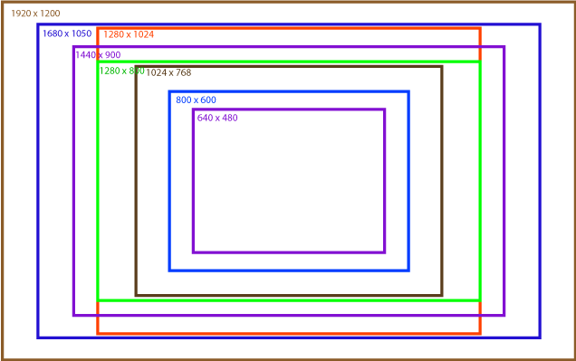
Its may changed by time not fixed
If browser is maximized in a wide web landscape screen, there appears large amount of horizontal layout space in the web design.
Look and Feel of the Website
- In its most basic terms, the “look and feel” of a website is how the site looks to the user and how it feels when he or she is interacting with it.
- The look and feel of the website affects the following
- Content
- Links
- Multimedia
- The “look” is defined by the following components of your website:
- Color palette
- Images
- Layout
- Font choices
- Overall styling
- The “feel” is determined by these characteristics:
- The movement and response of dynamic components like dropdown menus, buttons, forms, and galleries
- Sound effects
- The speed by which pages and images load
- The user first interacts with a look and feel right. So it is very important to have a consistent look and feel of the website.
- Following guideline must be followed while designing the look and feel of the website,
- Balance the design and content
- Content must be arranged logically and systematically. The access of the content must be provided well design designed navigation.
- Use a simple and direct design that makes it easy to access the content for the user.
- Void the complex technologies and unnecessary visual designs.
- Plan for easy access to the information
- The goal of the website is to provide correct content right. So it must be visible and placed well. So, organize the content in a meaningful navigable set of information.
- Users always want a specific piece of information. Provide direct links and easy access to the most demanded or expected information. User search system.
- Plan for Clear presentation of the website information
- Don’t use more colors, font-style and don’t arrange content in lengthy paragraphs. This makes complexity to read. It is not a readable or understandable form.
- Break the text into segments so the user can easily read the content.
- Use the right color scheme. It must be eye-catching. For example, use dark color against the white or light background. Use bold, italic, and underline, etc. type font style to point to specific or important words.
- Make use of plenty of white space to provide separation for the information.
- Use plenty of headings to the content, so user can find the content very fast.
Page Layout and Linking
Page layout means the arrangement of the content on the web page with some specification and standard. Following is typical web page layout.
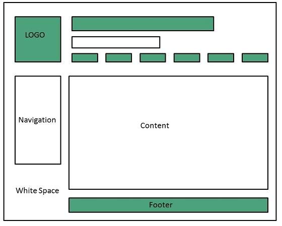
web page layout
We will see two types of page layouts
-
Flexible Page Layout
-
Fixed Page Layout
-
Also known as fluid page layout.
-
Works well for text based contents. But it can face different design challenges.
-
Wikipedia is the example of this layout
-
Components may in percentage widths, and thus adjust to the user’s screen resolution.
1. Flexible Page Layout
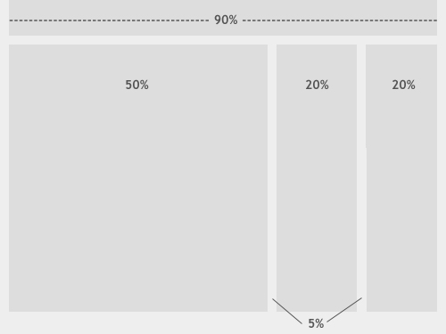
Flexible layout
Advantage
- This layout has the ability to fit in small screen resolution. Content of page wraps to fit the window.
- The amount of extra white space is similar between all browsers and screen resolutions, which can be more visually appealing.
- If designed well, a fluid layout can eliminate horizontal scroll bars in smaller screen resolutions.
Disadvantage
- The designer has less control over what the user sees and may overlook problems because the layout looks fine on their specific screen resolution.
- Images, video and other types of content with set widths may need to be set at multiple widths to accommodate different screen resolutions.
- With incredibly large screen resolutions, a lack of content may create excess white space that can diminish aesthetic appeal.
2. Fixed Page Layout
- A fixed website layout has a wrapper that is a fixed width, and the components inside it have either percentage widths or fixed widths.
- The important thing is that the container (wrapper) element is set to not move. No matter what screen resolution the visitor has, he or she will see the same width as other visitors.
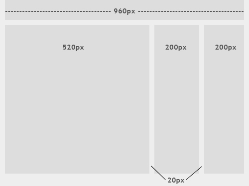
Fixed layout
Advantage
- Fixed-width layouts are much easier to use and easier to customize in terms of design.
- Widths are the same for every browser, so there is less hassle with images, forms, video, and other content that are fixed-width.
- There is no need for min-width or max-width, which isn’t supported by every browser anyway.
- Even if a website is designed to be compatible with the smallest screen resolution, 800x600, the content will still be wide enough at a larger resolution to be easily legible.
Disadvantage
- A fixed-width layout may create excessive white space for users with larger screen resolutions, thus upsetting “divine proportion,” the “Rule of Thirds,” overall balance, and other design principles.
- Smaller screen resolutions may require a horizontal scroll bar, depending on the fixed layout’s width.
- Seamless textures, patterns, and image continuation are needed to accommodate those with larger resolutions.
- Fixed-width layouts generally have a lower overall score when it comes to usability.
User-Centric Design
- Definition: The user-centric design means all the design efforts are made by keeping the user as a main important factor.
- Simply means the expectation of the user from the website.
- Based on the purpose of the visit, the design varies. For example, think about Google search engine. Google’s web page is very simple and has a lot of space, little text and media, and no advertisement.
- Google’s search results are very simple, links eye-catching.
Following are the important guidelines that must be considered while creating user-centric design,
1. Design for Interaction
- Think about how the user wants to interact with the information present on the website.
- Design the content type and decide where or which place the user likes to read the content on the website.
- Design with meaningful column headings, linked text, images, and short descriptions.
- Organize the links into the related category and separate the group with white space, border, or with graphics and background color.
2. Design for Location
- You know Fixed layout designs are like a printed page, which is enforced scanning the web page like paper-based reading habits. In this habit, the user’s eye moves from left to right and back again (Annoying on the website).
- In Flexible layout designs, users scan the information in a clockwise direction.
- According to Jakob Nielsen, users scan the page in an F-shaped pattern i.e. One vertical scan and horizontal scan. That means the user first reads from the top and then moves down to the page. And it is the vertical direction.
- Knowing the common user tendencies, helps the web designer to focus the user’s attention by object placement, text color, size of the font, background color, etc.
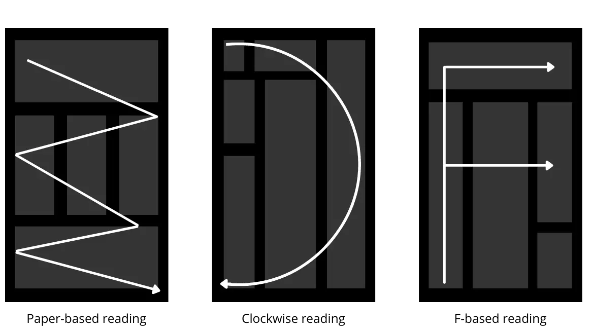
Design for location
3. Keep flat Hierarchy
- Organize the website based on various sections. Use category navigation so content categorized and the user can find it easily.
- Don’t design a complex navigation system it confused the user.
- Follow the three-click rule: means don’t make the user click more than three clicks.
- Think about the primary tasks or content that users want so much. And design accordingly.
4. Use Hyperlinking Effectively
- Hyperlinks are powerful that allows the user to move one web page to another web page or external website.
- By using linking, the non linear reading habit of user’s can be replaced in website design.
- “Click here” or “Read more” type links helpful textual clue to the destination link.
- User must able go next page or go back to previous page using hyperlinks.
- Hyperlinks useful to categorize the content and devide the content. So it makes simpler to user.
5. Limit the Number of Contents
- Don’t flood the website or web page with lot of information.
- Divide the information into smaller subsections.
- Display the content in structured manner with necessary space and meaningful navigation cues.
6. Reformat Contents for Online Presentation
- Web page content must be prepared for online reading. Don’t write like a book. User image, link, style, color, etc.
- Text width must be short, content must without horizontal scrolling.
- The font must be carefully designed of used for online reading.
- The white space on left creates a text column that enforces the left vertical flow of the page.
Sitemap
Definition: The sitemap is the structural overview of a site that shows the grouping of the pages based on the topic.
A sitemap is a representation of the content on your website that is created to help both people and search engines such as Google, Bing, Yahoo, etc.
In theory, it is the equivalent of an outline, but for websites, and comes in many forms and complexities. How site mapping is used can vary greatly as well. Some aren’t even designed to be deciphered by the human eye; instead, they are targeted for search engine crawl bots.
Need for Sitemaps
Now that you understand what sitemaps are, the better question is whether or not you need one. In general, site mapping is very useful during the web design process.
However, while many websites will benefit from having a sitemap, not every site needs one. According to Google, you should be site mapping if:
- Your site is really large
- Your site has a large archive of pages that are isolated or not linked to each other
- Your site is new and has few links to it
- Your site uses rich media content
Since Google is a search engine most of this recommendation is based on XML sitemaps, but the same could be said for HTML and visual sitemaps.
If your website project does not meet these guidelines, it is still a good idea to practice site mapping.
Representation of sitemap (types)
Generally speaking, site mapping helps us understand what’s on a website without reading the entire site.
There are three basic types of sitemaps, each with its own benefits and level of complexity. Here is a brief overview.
1. Visual Sitemap
Visual sitemaps are typically flat, 2D drawings or renderings that represent a site’s hierarchy.
They usually start with the homepage and illustrate how other pages link to it, providing a visual map of all of the parent-child relationships within a site.
This type of sitemap also shows movement – by demonstrating how users can navigate through a site. This helps designers plan for usability.
For example, a sitemap that is visual will diagram how the ‘about page’ connects to the ‘services page’ or point out that the ‘services page’ has three child pages detailing those services.
You can learn a lot about the structure of a site from a visual sitemap, making them highly useful when planning a website.
2. HTML Sitemap
Although drawings and renderings are typically helpful, sitemaps do not have to be visual. HTML site mapping can provide some of the same benefits as visual site mapping, but with a lot less effort.
nstead of creating a diagram, HTML site mapping produces a formatted list that you could read, but probably won’t if it’s long enough.
It doesn’t do as good of a job at showing how pages are linked together, however this easy-to-create outline is still useful.
To show the relationships between pages, it lists the parent pages and uses sub-bullets beneath them to show the child pages. If the site is large, however, this can quickly become a very long list.
If this seems like a simplistic approach, it is. In the early days of the internet, HTML sitemaps were more common.
Nowadays you can find them linked in the footer of some websites – accessible, but not really noticeable.
If users manage to find the link to an HTML sitemap, they can scroll through it, quickly browsing the site’s layout.
In today’s world of search, HTML sitemaps still serve as some users’ website table of contents.
3. XML Sitemap
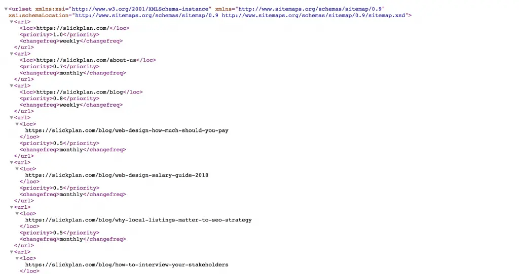
Whereas a visual sitemap can help designers plan for a website, and an HTML sitemap helps users browse the structure of a website, the XML format of your sitemap has an entirely different focus.
XML site mapping creates an outline of a site and displays the relationships between pages.
XML site mapping is created for bots, specifically search engine bots.
Dmitrii Kustov, Internet Marketing Director, Regex SEO
As a result, XML sitemaps require unique formatting to serve their purpose. Because XML website sitemaps serve search engine crawlers, such as Googlebots, you can use Google Search Console to both verify if your site has an XML sitemap and to submit your sitemap via Webmaster tools.
XML sitemaps can be created both by hand or by using tools. Once generated, the resulting XML file (aka sitemap.xml) is manually submitted to search engines for ‘crawling.’
For larger sites, which has over 20,000 pages indexed, it’s key to ensure Google can efficiently read the site.
Ideally, the bots review it and index the website on their search engine results pages (SERPs). At least this is what “should” happen.
In actuality, the process of submitting an XML sitemap file is not a guarantee of better search engine results – search engine bots do not need it to crawl a page but the practice of creating one and submitting it could help them do their job faster and with fewer errors.
Site Map Design Issues
- Map Production Method: Small maps and graphical maps can be designed on paper. Large maps should be produced dynamically as content changes.
- Forms of Sitemaps: The large sites require a frequent change in sitemaps using the textual sitemap. While small or static websites remain the same so graphical sitemap may useful.
- Map Details: The small site map should show the links for all pages while the big sites should show the links for important pages or main pages.
- Page Characteristics: Some important information such as file size, access rights, or any relevant details must be represented in the sitemap.
- Landmark Indication: Sitemaps should indicate important pages with text, color, size, images, or position cues. (for visual sitemap)
- Location Indication: Currently you are here feature added to the sitemap to let the user know about his current location.
Designing Effective Navigation
Navigation system allow the user to move from one page to another within in website.
Types of Navigation System
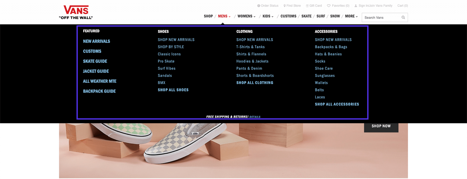
1. Global Website Navigation
With global website navigation, the menu and the links are identical across all pages of the website.
Many modern menus are designed this way, including the menu of our very own site here:
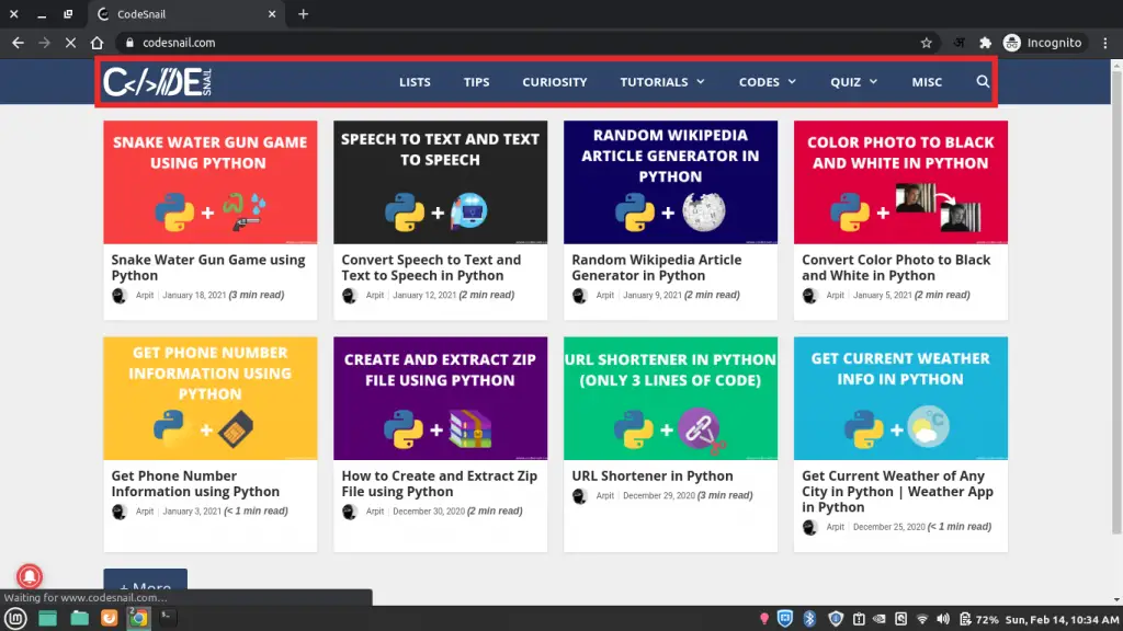
Global header menu
In the above screenshot, you can see our simple and easy to understand header menu.
It’s the same on all our pages and leads to some of our most important pages and content.
Our footer menu is also global and highlights essential sections of our website and some featured content.
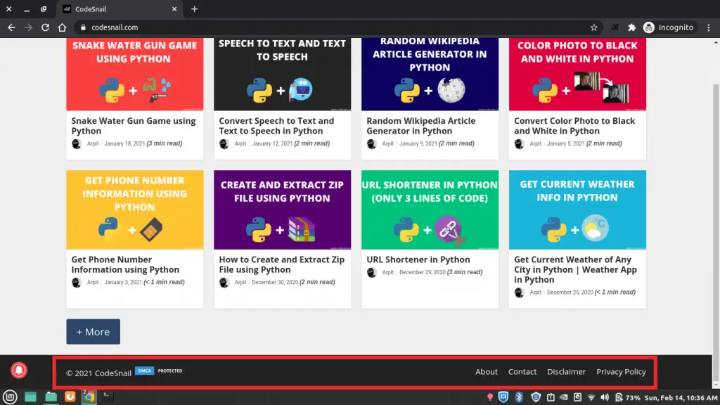
Global footer menu
2. Hierarchical Website Navigation
Hierarchical navigation means that the menus change depending on the context of each page.
Most newspapers and purely content-based websites feature hierarchical navigation.
For example, if you visit the top page of a newspaper, you will typically see links to the top news categories in the header menu.
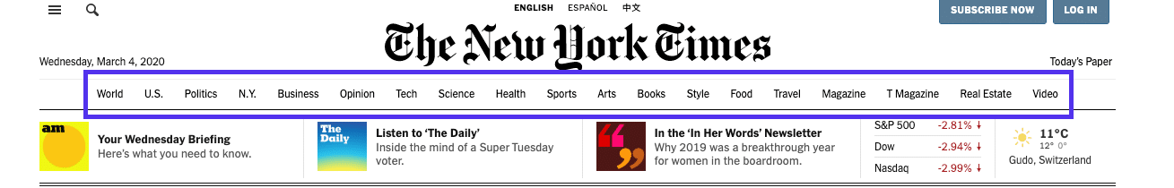
Hierarchical menu
If the menu were global, it would remain the same after clicking to a different category.
But because it’s hierarchical, it reveals new links that lead to subcategories of the category page we visit.
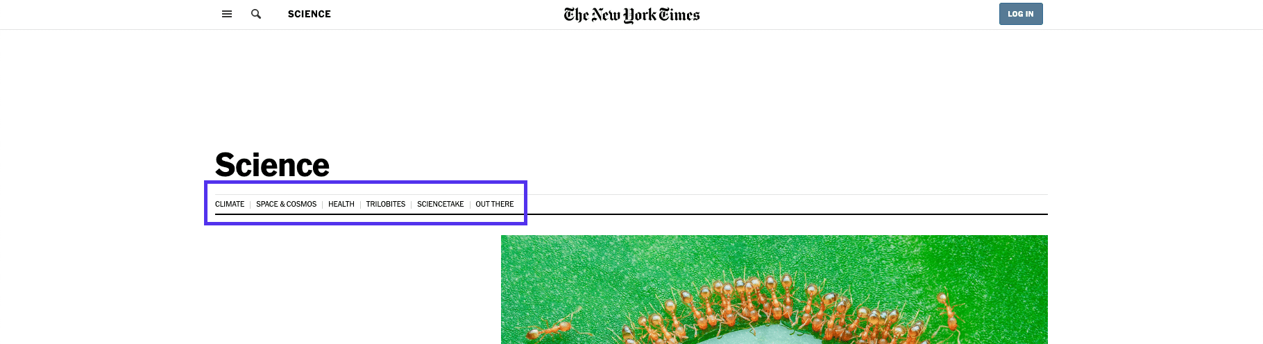
Hierarchical menu
On the New York Times’ Science page, you don’t see the top-level menu at all. Instead, you see links to different sub-sections of science research and articles.
This change is what separates this menu from a regular global one that you find on most smaller sites.
3. Local Website Navigation
In contrast to both hierarchical and global navigation, local website navigation refers to internal links that are included in the content itself.
Usually, the user is given options at the same level of a hierarchy or one level deeper, or links to navigate to other relevant pages.
A good example is magazine websites, which often use links to help readers explore the deeper context of a certain article.
If they mention an incident they’ve covered in the past, they will link to that article, instead of explaining it in-depth.
Local navigation
But it’s not just reserved for magazines and news websites. E-commerce stores rely heavily on this type of navigation menu to showcase products in the same category.
Local navigation
Internal linking is also a crucial aspect of SEO in general, and more specifically WordPress SEO, so it’s now standard practice for anyone who manages a website.
4. Ad Hoc Navigation
Ad hoc navigation is similar to links since it appears within the content of the website; however, it typically has a strong visual representation.
With ad-hoc navigation, the website presents visitors with large blocks to navigate to specific sections.
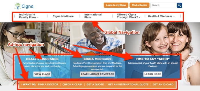
Ad-Hoc navitation
5. Wizards
Used effectively, wizards will direct visitors to a targeted area of the website that provides the information they are looking for. Here is an example of a wizard used on a clothing retailer:
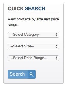
wizard
The retailer allows visitors to select the type, size, and price of the apparel they need.
When visitors select the information, they are presented with the clothing that matches their size and budget.
There are different types of wizards you can design for your website:
- Product specs wizards: using product specification to narrow down visitors’ search;
- Need & self-identification wizards: allowing the visitors to identify their need and their role to direct them to the appropriate section of the website.
Tips to design effective navigation
Here are 11 tips for improving your website navigation and ensuring happy, returning visitors:
- Plan your navigation
- Prioritize your pages
- Stick to conventions
- Consider creating a sticky menu
- Limit the number of items in your menu
- Create mega dropdown menus if necessary
- Add a search bar
- Label your menu clearly
- Link the logo back to the homepage
- Indicate what page the user is on
- Ensure visitors can reach any page from any page
Planning and Publishing Website
Planning Website
To develop the website, planning and process development are important activities.
Web design should always start with planning. planning is the first and important stage for ensuring the goals.
Planning phase is carried out,
- Deciding the goals and objectives, client’s requirements and expectations and user’s needs and expectations.
- Focusing on the team/developer which the website has to be developed.
- Do market research.
- Create prototype.
- Communicate with user and understand their requirements.
Objectives
According to James Lewis following must be the objectives of the web projects,
- Website project must be Specific.
- The website must be Measurable.
- The schedule of the website project must be Attainable.
- Deciding on a website project should be a Realistic approach.
- It should be Time-limited or should not be continued for a very long period.
These objectives are also called SMART objectives.
Target Audience
The contents of web are directly dependant upon the kind of users who are visiting the websites.
But it is observed that many web developers and designers do not make research on identifying the target users accurately.
For identifying the website’s success only checking the site traffic is not sufficient, it is equally essential to determine whether the objective of the website is fulfilled or not.
The web designers must find out what the target users want to see on the website or what will make the users to purchase the product or use the service.
Following are some ways to find out the target audience.
1. Market research
Market research will help you to understand exactly what kind of users is accessing your website and what is its demand.
There are many firms that provide these kinds of services to web companies. Hence your web company can give a contract to such firms for making the market research.
2. Focus groups
Getting the service for market research from some private firms is costly. Hence we can use another approach of identifying target users.
A focus group is a group of people who represent the target users or target audience.
The web companies can make use of focus groups for getting the feedback on proposed ideas on the website.
This group can also give the comment on how target audience think on the ideas that are put on the website.
3. Understand intranet audience
If your website is created for an intranet then intranet access is for several departments and every department has different needs.
Hence becomes very easy and manageable to understand the target audience for intranet.
Website Development Process
The life cycle of project is a complete project plan from inception to completion. The website development process can be accomplished in different stages. These are as follows,
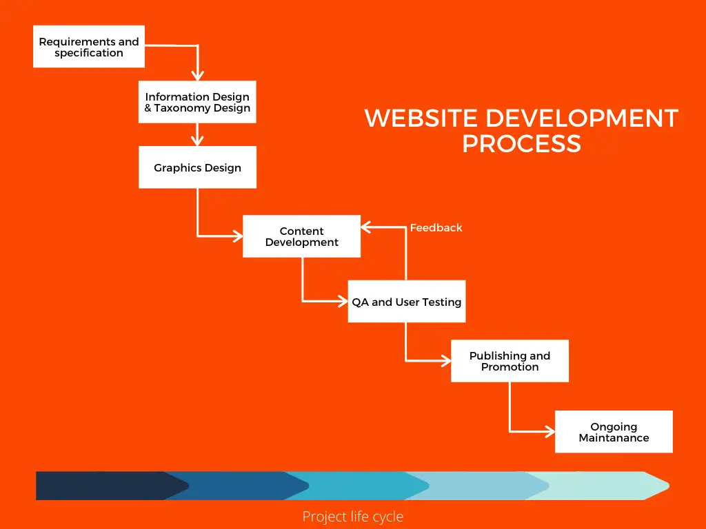
Website development process
Life cycle may varies according to project,
1. Requirements and Specification
In this phase, the requirements are collected from the users or clients. Requirements are nothing but the list of customer needs.
It may include the content of the website, search facility, tabbed menu, specific navigations, a particular color, branding requirements, etc.
These requirements are then analyzed and the Web development team prepares project specifications that contain design requirements, page layout sketches, technical requirements, and so on.
2. Information Design and Taxonomy Creation
In this phase, the designers prepare the structure of the site in such a way that the contents can be represented in the most meaningful way and easy to navigate by the target user.
During this stage, the taxonomy of the site information is developed. Taxonomy is for giving the section names and names to navigation links and menu system of the site.
3. Graphics Design
At the same time as information design and taxonomy creation, the design sketches and page mockups can be prepared for the site.
Prior to the page layout, the page mockup is usually sketched. The sample page mockup is as given below. These mockups can be easily modified based on the suggestions to create the Web page Design.
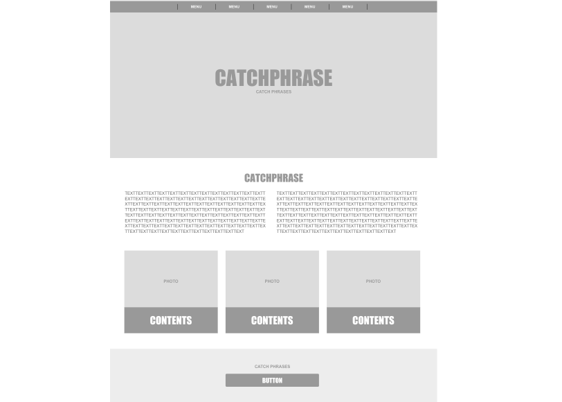
Web page mockup
4. Content Development
After the complete and stable design, the content development phase starts. In this phase, all the technical activities such as content development, coding, and validation are conducted.
Some sort of testing is done while loading the contents and evaluating the performance of the application.
5. Quality Assurance and User Testing
During this phase, the development team performs various tests such as cross-browser compatibility, connectivity at different bandwidths, testing links, data forms, and multimedia technologies.
6. Publishing and Promotion
During this stage, the website is published on the Internet or the organization’s intranet. The client then begins to make the promotion of this site.
7. Ongoing Maintenance
This stage begins as soon as the website gets live. The web contents must be updated and kept up to date.
New sections can be added based on the requirement. The newer interactive features can be added to make the site more interactive.
Process of Publishing Website
Publishing the website is a process of making the site live by upload the website files to the web server.
Following are the steps to publish the website,
Step 1: Choose Web Hosting Service Provider
Service provider are the company that provide the web servers to upload your website or web files to the server. Web server making website available to anyone who knows the URL of the website.
The web hosting service can be available for hosting both personal as well as business website.
The hosting service provides various service like email accounts, databases, etc.
Your domain is linked with your hosting to access the content from web server through domain name.
Step 2: Register domain name
Domain name indicates the actual location of the website or web pages on the web server.
The domain name are managed by Internet Corporation for Assigned Names and Numbers(ICANN).
You can buy domain names from vendors and then they register it with ICANN.
Then connect the domain with your hosting with nameservers.
Step 3: Upload files with File Transfer Protocol
To live your website, you mush send the web files, images, and other required files to the web server. For that FTP (File Transfer Protocol) is used.
Using Filezilla or FireFTP type FTP software can useful to upload files to the web server. You can also upload file using hosting providers web interface (cpanel).
Done, your site it live
We learned about designing guides, rules, web design patterns and how to publish the website. Share it with your friends. Happy coding :)
Also check,