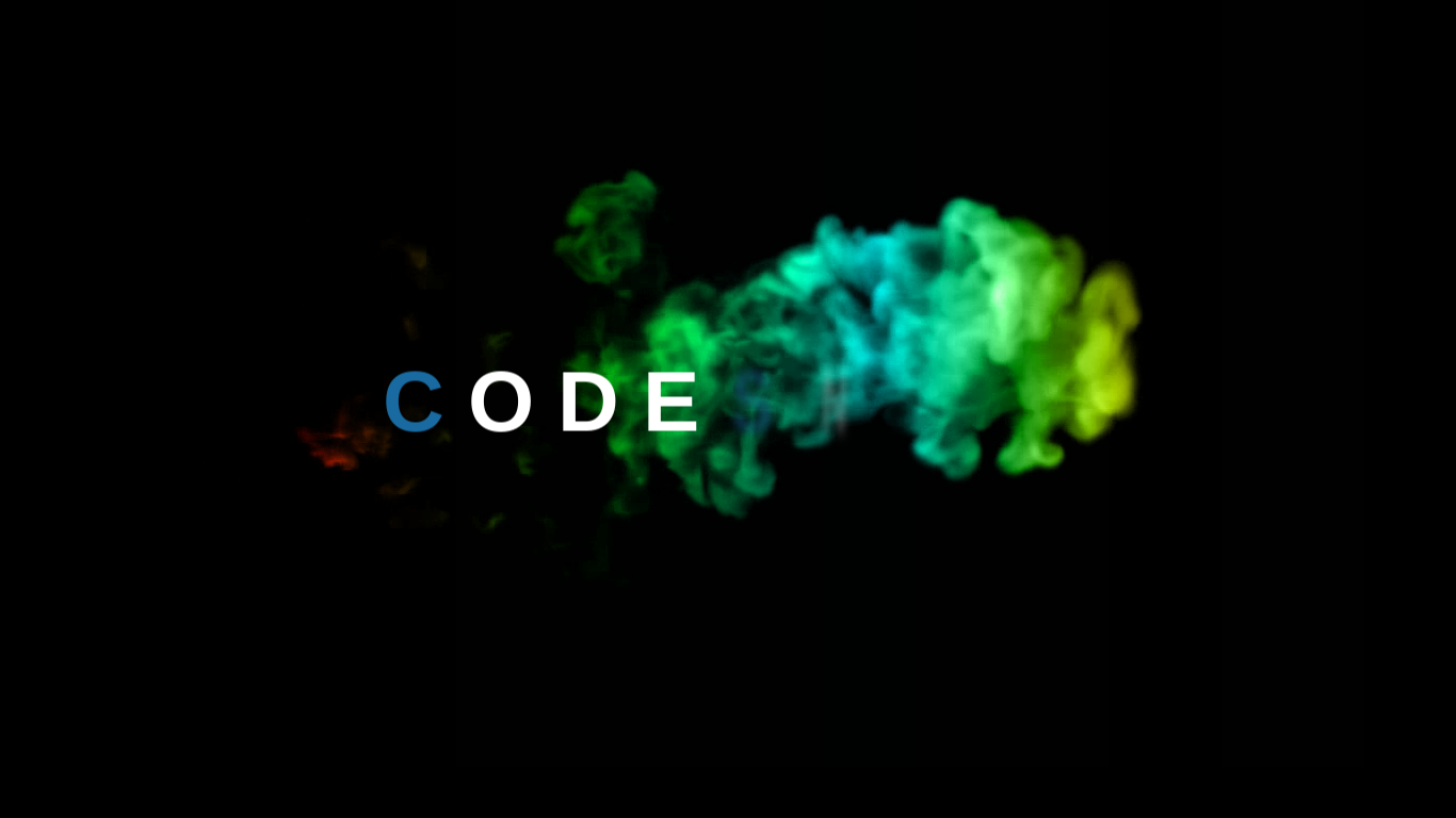
Pure CSS Text Reveal from Smoke Animation Effect 💨 | CSS Animation
Hello, Guys Today we create awesome Text Reveal animation with Colorful Smoke Animation Effect. This Animation is cool for your website and we use only HTML5 and CSS3. If you find awesome animation then you are in the right place. Here is the code of Pure CSS Text Reveal from Smoke Animation Effect 💨.
Pure CSS Text Reveal from Smoke Animation Effect 💨 | CSS Animation
Index.html
<!DOCTYPE html>
<html lang="en">
<head>
    <meta charset="UTF-8">
    <meta name="viewport" content="width=device-width, initial-scale=1.0">
    <meta http-equiv="X-UA-Compatible" content="ie=edge">
    <link rel="stylesheet" href="style.css">
    <title>Smoke</title>
</head>
<body>
    <section>
        <video src="smoke.mp4" autoplay muted></video>
        <h1>
            <span>C</span>
            <span>o</span>
            <span>d</span>
            <span>e</span>
            <span>S</span>
            <span>n</span>
            <span>a</span>
            <span>i</span>
            <span>l</span>
        </h1>
    </section>
</body>
</html>
Style.css
body{
    margin:0;
    padding:0;
}
section{
    height: 100vh;
    background: #000;
    overflow: hidden;

}
section::before{
    content: '';
    position: absolute;
    top:0;
    left: 0;
    width: 100%;
    height: 100%;
    background: linear-gradient(to right, #f00,#f00,#0f0,#0ff,#ff0,#0ff);
    mix-blend-mode: color;
    pointer-events: none;
}
video{
    object-fit: cover;
}
h1{
    margin: 0;
    padding: 0;
    position: absolute;
    top: 50%;
    transform: translateY(-50%);
    width: 100%;
    text-align: center;
    color: #fff;
    font-size: 5em;
    font-family:sans-serif;
    text-transform: uppercase;
}
h1 span{
    display: inline-block;
    animation: animate 1s linear forwards;
}
@keyframes animate{
    0%{
        opacity: 0;
        transform: rotateY(90deg);
        filter: blur(10px)
    }
    100%{
        opacity: 1;
        transform: rotateY(0deg);
        filter:blur(0)
    }
}
h1 span:nth-child(1){
    color:#186aa0;
    opacity: 0;
    animation-delay: 2s;
}
h1 span:nth-child(2){
    opacity: 0;
    animation-delay: 2.5s;
}
h1 span:nth-child(3){
    opacity: 0;
    animation-delay: 2.75s;
}
h1 span:nth-child(4){
    opacity: 0;
    animation-delay: 3s;
}
h1 span:nth-child(5){
    color:#186aa0;
    opacity: 0;
    animation-delay: 3.5s;
}
h1 span:nth-child(6){
    opacity: 0;
    animation-delay: 3.75s;
}
h1 span:nth-child(7){
    opacity: 0;
    animation-delay: 4s;
}
h1 span:nth-child(8){
    opacity: 0;
    animation-delay: 4.5s;
}
h1 span:nth-child(9){
    opacity: 0;
    animation-delay: 4.75s;
}
Output
You need to a smoke.mp4. Download video and source code of this animation here:Download
I hope you like this animation. Now explore this animation and share this code with your friends.
