CSS Flexbox
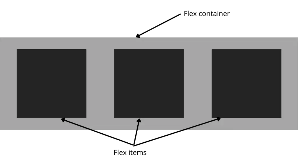
Flex box contains flex items and flex container. In CSS, the concept of Flex box is as follow,
The container can be displayed as,
.container{
   display:flex;
}

/*the flex items can be defined as*/

.item{
   order:3;
}
The flex items are placed in the flex container. The flexbox is a single direction layout concept. The flex items layout is either in horizontal rows and vertical columns.
The flex direction as shown bellow
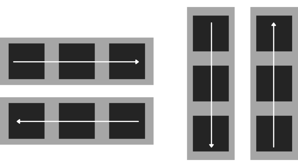
.container{
   flex-direction: row; /* you can use row-reverse, column, column-reverse*/
}- row: left to right in ltr, right to left in rtl
- row-reverse: right to left in ltr, right to left in rtl
- column: same as row but top to bottom
- column-reverse: same as row-reverse but bottom to top
example,
See the Pen flexbox by Arpit (@soniarpit) on CodePen.
Various properties of flex are,
| Property | Description |
|---|---|
| display | Specifies the type of box used for an HTML element |
| flex-direction | Specifies the direction of the flexible items inside a flex container |
| justify-content | Horizontally aligns the flex items when the items do not use all available space on the main-axis |
| align-items | Vertically aligns the flex items when the items do not use all available space on the cross-axis |
| flex-wrap | Specifies whether the flex items should wrap or not, if there is not enough room for them on one flex line |
| align-content | Modifies the behavior of the flex-wrap property. It is similar to align-items, but instead of aligning flex items, it aligns flex lines |
| flex-flow | A shorthand property for flex-direction and flex-wrap |
| order | Specifies the order of a flexible item relative to the rest of the flex items inside the same container |
| align-self | Used on flex items. Overrides the container’s align-items property |
| flex | A shorthand property for the flex-grow, flex-shrink, and the flex-basis properties |
Previous: CSS Variables
Next: CSS Media Queries